SHARE
SHARE
Demand Curve: Definition, Types, and Examples
Sovia
Ever wondered why the same food can sell like hotcakes at one time but be completely ignored at another? The answer lies in the demand curve.
For business owners, understanding this concept is more than just economic theory, it’s a key tool for reading trends, responding to the market, and boosting sales.
This article will explain the demand curve in a clear and simple way, complete with a demand curve illustration, practical examples, and the factors that cause shifts in the curve.
What is a Demand Curve?
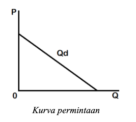
A demand curve is a graph that shows the relationship between price and the quantity of goods demanded.
It illustrates how consumer demand changes when the price of a product increases or decreases.
On a demand curve, the price is displayed on the vertical axis, while the quantity demanded is shown on the horizontal axis.
This graph helps you see whether demand increases or decreases at certain price points.
The demand curve is based on real market data, typically arranged in a table known as a demand schedule.
This table outlines how much of a product is demanded at various price levels, assuming other factors remain constant (ceteris paribus).
Quantity demanded (Qd) refers to how much of a product consumers want to buy at a specific price.
This may differ from how much is actually bought, especially when stock is limited.
Demand also depends on consumer purchasing power and a given period of time.
Meanwhile, demand (D) refers to the total quantity of goods consumers are willing to buy at all price levels during a specific period.
This data is used to create the graph we know as the demand curve.
Here’s an example of a demand curve:
Source: ginee.com
The demand curve is also a useful analytical tool for business owners.
With this graph, companies can evaluate how interested consumers are in their products at various price points.
When prices go up, demand usually decreases. Conversely, when prices fall, demand increases.
This pattern creates a downward-sloping curve from the top left to the bottom right.
Demand and supply curves are often used together to understand market equilibrium.
The point where the two curves meet indicates the ideal price and quantity in the market.
By understanding both the demand and supply curves, you can better plan your sales strategy and set product prices more accurately.
Types of Demand Curves
In economics, demand doesn’t always follow a straight line. There are several types of curves that illustrate how consumers respond to price changes.
With the help of demand curve graphs, it becomes easier to understand these behaviors. Here are three main types of demand curves you should know:
1. Downward-Sloping Demand Curve
This is the most common type. It shows an inverse relationship between price and quantity demanded—when the price increases, demand decreases; when the price drops, demand increases.
This behavior aligns with the law of demand.
This type of curve applies to normal goods that have substitutes.
When the price of a product goes up, consumers tend to switch to more affordable alternatives.
The graph typically slopes downward from the top left to the bottom right.
2. Upward-Sloping Demand Curve
This curve shows a positive relationship between price and demand. When prices increase, demand also increases, contrary to the law of demand. This occurs only for certain types of goods:
- Veblen goods: Demand rises because the product is seen as a status symbol. Higher prices make it more desirable.
- Giffen goods: These are inferior goods whose demand decreases when the price falls.
An example of a Giffen good could be secondhand clothing. If the price drops, consumers may perceive it as lower quality.
But if prices rise, they may assume the items are new or of better quality.
This phenomenon highlights how price can influence perceived value, not just purchasing power.
3. Kinked Demand Curve
Often found in oligopoly markets, where a few major players dominate, this curve illustrates different consumer reactions to price changes.
If prices go up, demand drops significantly because consumers are highly sensitive.
For example, a 15% price hike could lead to a demand drop of more than 15%.
However, if prices go down, demand only increases slightly, a 10% price cut may lead to less than a 10% rise in demand.
The graph features two straight lines forming a sharp angle.
This emphasizes that pricing strategies in oligopolistic markets must be approached with extreme caution.
Read more: Easy and Practical Way to Create a Profit and Loss Statement for Food Sales
Factors That Shift the Demand Curve
The demand curve can shift due to various reasons.
A shift in the demand curve reflects a change in the quantity demanded even when the price remains the same.
Below are the key factors behind this shift:
1. Consumer Income
When consumers earn more, their purchasing power increases, leading to higher demand for goods and services.
On the flip side, lower income tends to reduce demand. This is one of the primary reasons a demand curve shifts left or right.
2. Prices of Substitute Goods
If the price of a substitute product rises, consumers may switch to your product, increasing its demand.
Conversely, if the substitute becomes cheaper, demand for your product may fall, causing a shift in the demand curve.
3. Level of Need
Demand increases for goods considered essential in daily life. For instance, during the rainy season, demand for umbrellas and raincoats spikes.
The more urgent the need, the more likely the demand curve will shift.
4. Consumer Preferences
Trends, lifestyle changes, and shifts in taste can significantly influence demand.
When consumers favor a product over another, demand for that product increases. Trends often trigger quick shifts in the demand curve.
5. Price of the Product Itself
Although price doesn’t shift the curve, it affects movement along the curve.
When price increases, demand typically falls; when price drops, demand rises. These movements occur along the curve, not as shifts.
6. Competitor Pricing
If competitors offer lower prices, customers may switch, reducing demand for your product.
That’s why conducting price research is crucial before setting your pricing strategy.
Read more: Want Smooth Operations? Here’s Why Understanding Stock Buffer Is Key for Your Business!
Conclusion
The demand curve is more than just an economic theory, it’s a vital tool for business owners in any industry, including F&B.
By understanding the types of demand curves, the factors that influence them, and how shifts occur, you can make smarter pricing and marketing decisions.
Armed with real-life examples and demand curve illustrations, you’ll be better prepared to adapt to market dynamics.
Now is the time to digitalize your business with ESB!
If you want deeper insights into consumer demand and wish to make data-driven decisions, there's no better time to switch to a digital system.
Leverage ESB’s solutions to streamline every aspect of your F&B operations, from POS systems, ERP, online food ordering, and supply chain management, to customer queue systems.
Improve efficiency and boost your sales, contact the ESB Team right now.
SHARE