
A pivot table is an Excel feature designed to help organize and analyze data efficiently.
This tool allows you to group data based on specific categories and display the results in an interactive table format.
You can easily view data summaries, calculate totals, averages, or other statistical values, all in just a few clicks.
With pivot tables, data processing becomes faster and more structured. You can customize the table layout as needed without altering the original dataset.
This feature is especially useful for generating reports or making data-driven decisions.
If you often work with large amounts of data, pivot tables could be the perfect solution. Let’s explore more about pivot tables in this article!
Functions of Pivot Tables
Pivot tables in Excel simplify the process of analyzing and organizing large datasets.
They help you draw conclusions more quickly and accurately because all the data is presented in a neat and concise format.
Here are some key functions of pivot tables:
1. Display Large-Scale Data
Pivot tables can present thousands of data entries in an easy-to-read format. You can adjust the layout based on your analysis needs.
2. Group and Calculate Numerical Data
This feature is useful for creating subtotals, aggregations, or calculations based on specific categories.
It allows you to easily identify trends or patterns in your data.
3. Summarize Source Data
Pivot tables let you move rows to columns or vice versa to gain different perspectives from your data source.
4. Filter and Focus Data
You can filter specific data, sort it, and even apply conditional formatting to focus on the most relevant information.
5. Create Concise and Informative Reports
By selecting the necessary fields, you can build well-structured reports that exclude unnecessary information.
6. Easier Data Visualization
Use pivot charts to turn raw data into clear, visually appealing graphics, perfect for presenting insights to your team or clients.
How Pivot Tables Work

Source: freepik.com
To understand how pivot tables work, you need to get familiar with four main components. Each one plays a key role and works together seamlessly.
1. Columns
Columns display data based on unique values, typically dividing information horizontally to improve readability.
2. Rows
When you assign a field to the row area, Excel displays it in the far-left column. Each row will show only unique values, no duplicates.
3. Values
This section shows calculated results such as sums, averages, maximums, or minimums. The values are neatly arranged in cells to ease analysis.
4. Filters
Filters let you sort and focus the data based on your needs. You can easily highlight only the information you want to analyze.
Pivot tables are incredibly practical, they organize your data into a more compact, flexible, and interactive format.
Perfect for anyone looking to analyze data efficiently.
Read more: Easy and Practical Way to Create a Profit and Loss Statement for Food Sales
How to Create a Pivot Table
Want to know how to create a pivot table in Excel the easy way? Follow these simple steps to make your data analysis faster and more effective.
1. Prepare your data in table format
Make sure your data is neatly arranged in columns and rows. Use one dedicated header row and avoid blank cells within the dataset.
2. Sort your data beforehand
Organize your data by sorting it based on one of the columns. This helps pivot tables work more optimally and improves analysis accuracy.
3. Click on “Insert” and select Pivot Table
Source: ESB
Go to Excel’s menu bar, click the “Insert” tab, then select “Pivot Table” in the top-left corner.
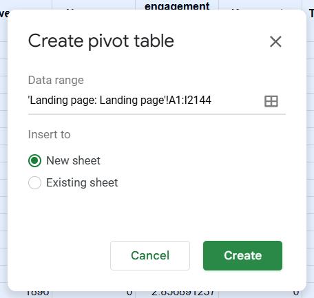
4. Set the data source and pivot location
Source: ESB
Choose whether you want to use data from the active sheet (From Table/Range) or from an external data source. Then decide whether the pivot table should appear in a new worksheet or the current one.
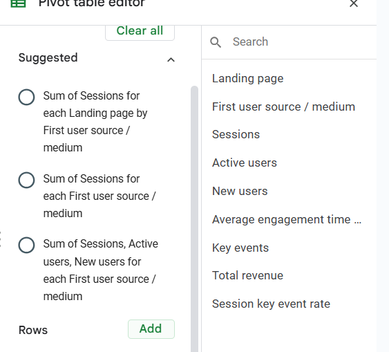
5. Configure the PivotTable using the Fields panel
Source: ESB
Excel will display the PivotTable Fields panel on the right. Drag the necessary fields into the appropriate areas: Filters, Columns, Rows, or Values.
6. Drag data to the appropriate area
Source: ESB
- Filters: to filter data quickly
- Columns: to show data as columns
- Rows: to show data as rows
- Values: to display numeric data for analysis
7. Adjust value type as needed
Right-click the value column, then select “Field Settings.” Choose the calculation type you want, Sum, Average, Max, Min, etc.
Pro tips:
Use clean tabular data and avoid using multiple headers. If your data is complex or stacked, use the Power Query feature to clean it up beforehand.
Understanding how to create pivot tables is a crucial step toward more efficient and professional data analysis.
Read more: Not Good at Accounting? No Worries, Small Businesses Can Use Simple Handwritten Bookkeeping
Conclusion
Pivot tables are a powerful feature for quick and easy data analysis. They allow you to identify trends, calculate totals, compare performance, and generate automated reports. This functionality is valuable across various fields, from finance and marketing to operations.
With a simple workflow and clear creation steps, anyone can start using pivot tables today.
However, if you’re looking for a more comprehensive approach to data management, pivot tables alone won’t be enough. You need a system that integrates financial reports, inventory movement, and business performance across multiple branches. One solution is ESB Core.
ESB Core is an ERP system that automates business processes from end to end.
You can manage inventory, calculate COGS, perform stock takes, and generate complete financial reports, all in one place.
Monitor your business performance in real-time from a single system.
With ESB Core, business decisions can be made faster and more accurately, based on reliable data.
Contact the ESB team today and get a consultation for your business!